 I'm still learning that you don't have to cover every single bit of page with something. I like the blank bits.
Thursday, September 28, 2006
Multi-tasking
 I'm still learning that you don't have to cover every single bit of page with something. I like the blank bits.
Saturday, September 23, 2006
Proud Mama

A couple of weeks ago in a comment someone asked me to do a step-by-step of one of my journal spreads. It probably would have been better to have taken pictures as I went along, but I didn't. Maybe this will be of interest to someone. I posted the page recipe to CompositionArtJournals a few days ago. I'll put it here in a separate post. You'll see that I didn't follow it very closely.
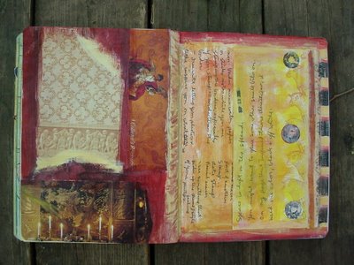
I sat down this morning intending to try out my latest page recipe, #3 borders. I picked my three items: first a newspaper ad that features my son. I've been meaning to put this in my journal for a couple of months and someone mentioning seeing it in the paper again on Thursday prompted me to dig for it in my box of "things to journal with". Next came a page from a notepad that I got in an ephemera swap. The paper color and feel made me consider it and the lines that went with the stripes on my son's shirt sealed the deal. My first two items being black and white,
I was ready for some color. I decided I was in the mood for black, brown, red and white. I just needed a color photo to go with the scheme. On the floor was a magazine page with a great picture of buttons in frames hanging on a paneled wall. I had my three photos (sort of).
I glued the clipping on the left page and the button photo on the right and decided that I wanted my note paper to sit on top of the paint, so I just picked a position for it overlapping the button photo. I used a small brush and brown fluid acrylic to paint a narrow border around the clipping. Then I did the same around the button pic with black. Then again around the clipping with some red paint mixed with brown to tone it down a bit.
By this time I decided I needed one more photo, so it was back to my magazine. I found a great shot of circles of different fabrics. One paisley was perfect. I cut it out and glued it down behind where the note paper would go. My recipe called for three photos, but recipes are meant to be guides, not rules.
I painted another border of the red/brown around where the notepaper would go and a brown border around the paisley fabric circle. Next was a third border, off white this time around the clipping. I decided to just finish off the bottom of the left page in white thinking I could add more paint over the white if I wanted to. I added a white border next to the black around the button photo and above the notepaper.
Then a black border around the paisley and another black one in the lower right corner which I painted brown and added a stamped date in red/brown. That just left the center portion of the right page which I painted brown at the bottom and red/brown at the top. I didn't like that so I smeared some red over the brown area.
My recipe calls for stamping in the borders, so I picked out one of my favorite stamps which is just slice of an eraser cut with a serated knife. I stamped in black on the two red/brown borders. That made the borders really pop. I finally glued down the notepaper after I wrote on it.
The big white space was really bugging me, so I glued a strip of paper from an old book of sheet music. Around it I painted two narrow borders, brown and black. It seemed to still need more color, so I painted five red dots. I thought these would work with the buttons. The page was starting to come together, but I still wasn't happy with all of the white. There was a piece of needlepoint canvas laying on my work table and I put it over part of the white border and stamped black ink through that. It looked great, so I stamped all of the white borders on the spread. Wow, much better!
The last things I added were the strip of text, favorite things because it was laying on the table and seemed to fit; the circle punched brown paper on the paisley; a little bit of black next to the paisley to extend the line of black from the bottom of the page and a stamped date.
I liked the way it looked, but then I got the idea to sew on a real button. I usually don't put many things like this in my journal because they tend to make it hard to work on the later pages. I'll probably be sorry, but I love the way it looks.
I didn't notice until much later that the circle of paisley mimics the circular photo. I love it when things work out like that.
Monday, September 18, 2006
Spanish fruit stickers!
Saturday, September 16, 2006
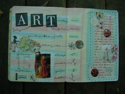
Art soothes me...
 Looking through Pam Garrison's blog last night got me fired up for pink and blue. She has some wonderful pages and I love looking at all her photos. I really must get it together and get a new camera.
Thursday, September 14, 2006
September 13
 This is what happens when I don't have a journal page prepped and I feel the need to journal. I wound up writing on printer paper and gluing it into the journal later. Then I couldn't stand the plain white paper, so I painted on some glaze that I added drops of paint to. I'm not sure what was going on on the other page. I rarely have a whole page without any writing. The journaling that I had to get down was a new page recipe. Hopefully I'll get it typed up soon so I can share it.
Daisies
 I included a scan of a postcard I made for Kathrin from Germany on this spread. I've had these particular banana stickers saved to make her something for ages waiting for inspiration. Finally it hit and I liked the way it turned out. The round daisy label is from a tub of sour cream. I guess they have these cool flower sayings on all their tub. I threw away another one in a rare spurt of clutter control. I won't be buying anymore soon because I discovered that I have a large gallstone last week. I've been on a low fat diet for two weeks now. Pain is a great motivator to change the way you eat. One benefit is that I've lost over five pounds.
Friday, September 01, 2006
I may never get to Venice
 These photos of Venice and the flowers and dove frame were all laying on my worktable last night when I went up to paint a background spread. I slapped the one on the left and the flowers on and started painting around them. Then I put the other two and did the writing. I wanted to match up the color and design in the photos so I used the lavender and black. I like the filagreed look of the postcard word stamp. I think I was inspired for this page by some of Dan Eldon 's work. Not that I think this looks anything like his. I just wish I had taken the pictures, or at least the Venice ones.
Yakima wine labels

The bottles of wine from our wine tasting tour in Yakima Valley are all gone and I finally took off the labels and threw away the bottles. I'm reallly surprised at how much I enjoyed the wine tour. It wasn't so much the wine as getting to meet the people at the wineries and taking a slow, leisurely drive through the valley. It was nice sipping the wine at home and remembering the day too.
Subscribe to:
Comments (Atom)


